
React Bits backgrounds
Use React Bits animated backgrounds in Honeydeck with shadcn and transform-aware sizing.
React Bits backgrounds
Runnable demo: Use the
demos/react-bits-backgroundsproject on GitHub to try this setup in a complete Honeydeck deck.
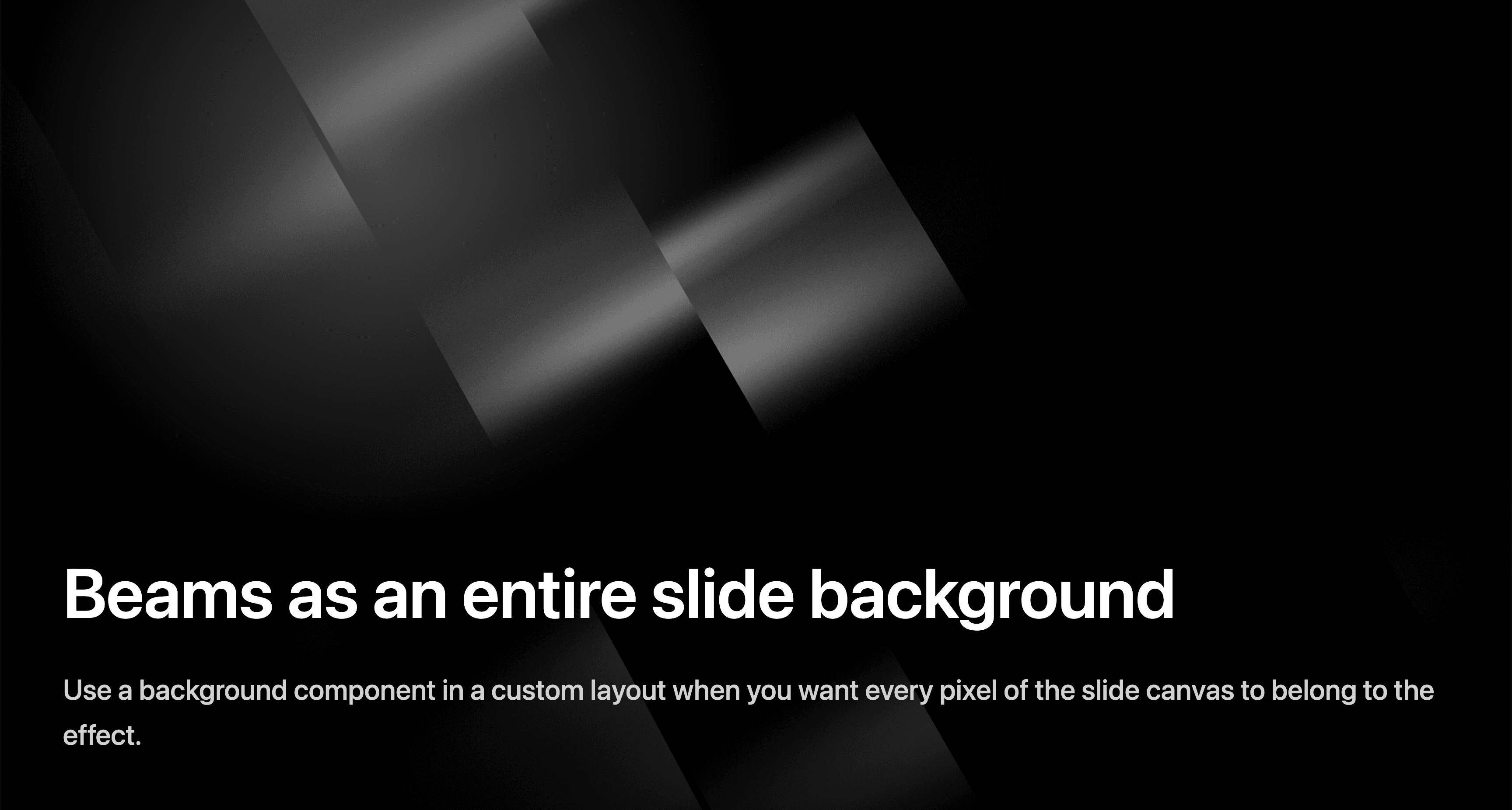
React Bits provides animated React backgrounds and effects. They are not part of Honeydeck core; install them into your deck like normal user-space components.
This guide uses Beams as the example background.
Minimal shadcn setup
React Bits components can be added through the shadcn CLI. Honeydeck does not need a full app scaffold, but shadcn needs a small components.json and path aliases, matching the manual shadcn setup.
Add a components.json file:
{
  "$schema": "https://ui.shadcn.com/schema.json",
  "style": "new-york",
  "rsc": false,
  "tsx": true,
  "tailwind": {
    "config": "",
    "css": "styles.css",
    "baseColor": "neutral",
    "cssVariables": true,
    "prefix": ""
  },
  "aliases": {
    "components": "@/components",
    "utils": "@/lib/utils",
    "ui": "@/components/ui",
    "lib": "@/lib",
    "hooks": "@/hooks"
  },
  "registries": {
    "@react-bits": "https://reactbits.dev/r/{name}.json"
  }
}
Add a matching alias to tsconfig.json:
{
  "compilerOptions": {
    "baseUrl": ".",
    "paths": {
      "@/*": ["./*"]
    }
  }
}
Some shadcn registry items expect a utility helper. If needed, create lib/utils.ts:
import { type ClassValue, clsx } from "clsx"
import { twMerge } from "tailwind-merge"

export function cn(...inputs: ClassValue[]) {
  return twMerge(clsx(inputs))
}
Install the helper dependencies if your added component needs them:
npm install clsx tailwind-mergeAdd Beams
Run the shadcn CLI from your deck project:
pnpm dlx shadcn@latest add @react-bits/Beams-JS-CSSThe command writes the component into your project and adds dependencies such as three, @react-three/fiber, and @react-three/drei when required.
Use Beams inside a slide
For an inline panel or card, import the generated component and give it a sized wrapper:
import Beams from './components/Beams'

<div style={{ width: '1080px', height: '1080px', position: 'relative' }}>
  <Beams
    beamWidth={3}
    beamHeight={30}
    beamNumber={20}
    lightColor="#ffffff"
    speed={2}
    noiseIntensity={1.75}
    scale={0.2}
    rotation={30}
  />
</div>
Use Beams as a full-slide background
For edge-to-edge backgrounds, prefer a custom layout. Honeydeck renders each slide at a logical canvas size, then scales the slide with CSS transforms to fit audience, presenter, preview, and export surfaces.
Most HTML content does not need to know about that scale. Canvas and WebGL libraries often do, because they measure their container with getBoundingClientRect(). That measurement includes CSS transforms, so the effect can accidentally render at the transformed display size instead of the logical slide size.
Use useHoneydeck() and useSlideScale() to give the background an inverse-sized wrapper:
import { useHoneydeck, useSlideScale } from "@honeydeck/honeydeck"
import type { LayoutProps } from "@honeydeck/honeydeck/types"
import Beams from "../components/Beams"

export default function BeamsBackground({ title, children }: LayoutProps) {
  const { slideWidth, slideHeight } = useHoneydeck()
  const slideScale = useSlideScale()

  return (
    <div className="relative h-full w-full overflow-hidden bg-black text-white">
      <div
        className="absolute left-0 top-0"
        style={{
          width: slideWidth / slideScale,
          height: slideHeight / slideScale,
        }}
      >
        <Beams />
      </div>

      <div className="relative z-10 grid h-full place-items-center">
        {title && <h1>{title}</h1>}
        {children}
      </div>
    </div>
  )
}
Then register and use the layout:
import { DefaultLayout } from "@honeydeck/honeydeck/layouts"
import type { LayoutMap } from "@honeydeck/honeydeck/types"
import BeamsBackground from "./layouts/BeamsBackground"

export default {
  BeamsBackground,
  Default: DefaultLayout,
} satisfies LayoutMap
---
layouts: "./layouts"
layout: BeamsBackground
---
# Beams as a backgroundSee Runtime context for more detail on transform-aware canvas and WebGL components.
Runnable example
For a complete example, see demos/react-bits-backgrounds on GitHub. It includes the minimal shadcn setup, the generated Beams component, and a custom full-slide background layout.